Idea Summary
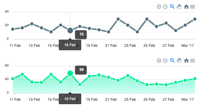
Multiple charts which you can link together (based on the same label name [date, deparment, etc]) that displays information graphically, making relationships among the data easier to understand.
Use Case
Multiple charts that displays information graphically, making relationships among the data easier to understand.
Preferred Solution (Optional)
There is a Cookbook on Oracle Jet:
https://www.oracle.com/webfolder/technetwork/jet/jetCookbook.html?component=dataVisualizations&demo=correlatedChart
It would be nice if this could get implemented in APEX itself.