Idea Summary
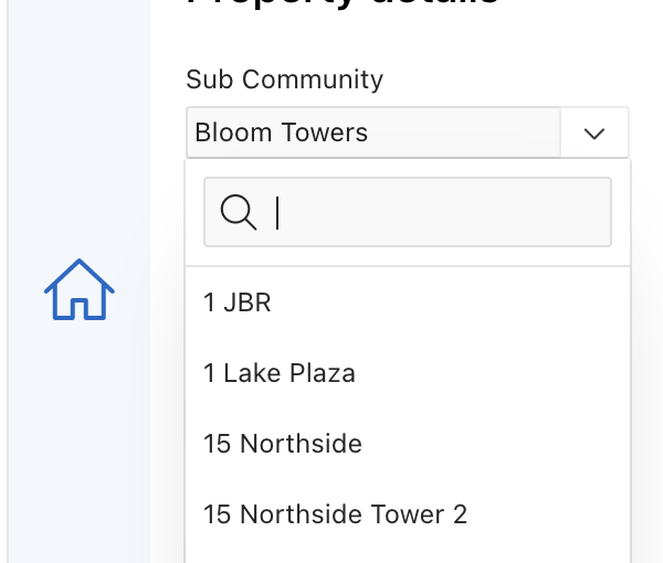
Simply it is a flow-breaker, super inconvenient to end-users, and an unnecessary box on the screen.
It is even worse when it comes to mobile screens. I have never seen any successful app/website that shows extra stuff on UI.
This request might not get many votes simply Cuz many developers do not focus on the UX …


The Solution is simple,
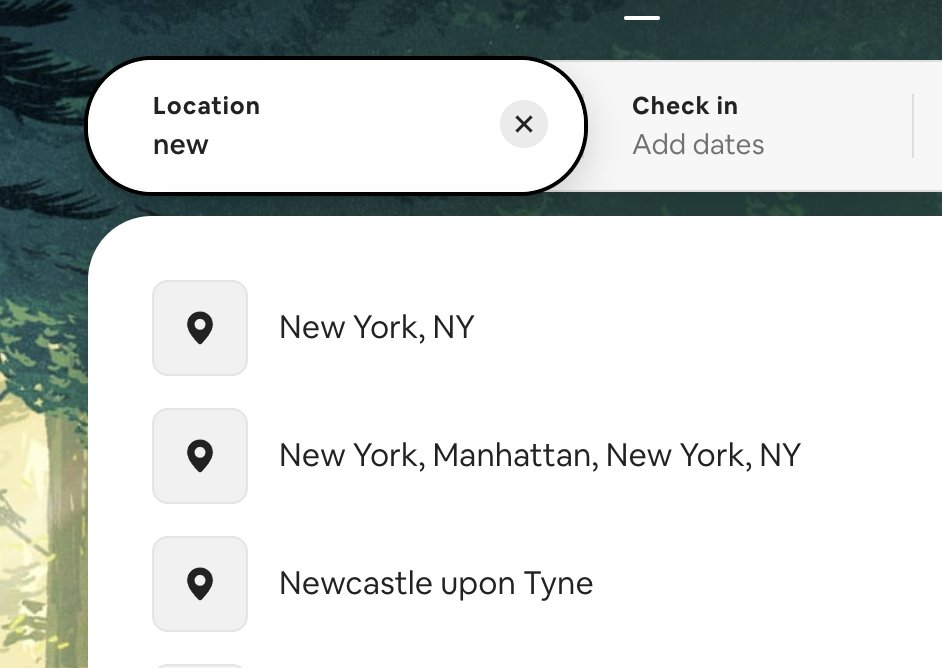
PopLOV should behave in the same way as any auto-complete fields you see online such as Google, Airbnb, Trulia …